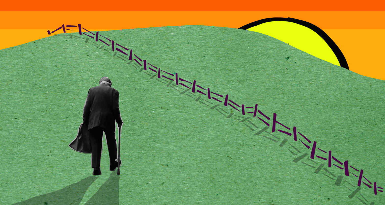
Almost every 30-something person I know has a similar story – a moment where their parents or grandparents have tried to achieve something ‘simple’ online (renew a license, download a government app, order a taxi) only to have failed miserably leaving everyone, especially that parent or grandparent incredibly frustrated. From this point, it’s not a difficult path to statements like, “I’m a tech luddite” or “I’m terrible at technology”. From there, the easiest path is the one of least resistance – to opt-out of technology.
It’s not technology’s fault, it’s ours
I don’t know a single software designer, who, at some point in their career, hasn’t done the following:
A new feature is being designed. It’s, in the scheme of the project, a relatively minor one for an application that already exists. The risk of getting it wrong *feels* low, and there’s a huge backlog of work coming up on the horizon that the team is panicking about. It would take 5 days of work to design, test, re-design this particular feature with the users of the application to make sure we get it right. It would take 2 hours to do a quick scan of the world’s biggest software companies (Google, Facebook, Instagram, Netflix) to see how they solve the problem and replicate that in as much as it makes sense to do so. Sure enough, we pick the second option – just this once.
The decision to trade-off time-to-release with usability feels, in the moment, like a pretty low impact one. We use everything in our designer-y brain to justify that decision:
- The team is under a lot of time pressure
- It’s just a small feature
- Chances are, our users are people who also use Google, Facebook, Netflix etc, so we’ll leverage that familiarity to de-risk it
- Our small team doesn’t have the budget to test everything but we know Google, Facebook, Netflix etc do heaps of testing, so we can trust that by proxy
And sure, on paper, this seems pretty reasonable. Maybe even off paper, when the feature is shipped, the customer service team isn’t inundated with support requests and so, maybe it worked? Maybe if it worked once, it can work again? The next time those factors of time, size of feature, and risk of getting something wrong is true? What if we did it again, and again, and again? Each designer, in each different team. What happens in a year, or two years, or three years down the track?
The slow proliferation unusability (and language)
A knowledge of how anything works is cumulative. If the first strawberry we ever taste is sweet, we’ll assume all strawberries are sweet until you taste one that isn’t. After that, we realise that some strawberries are sweet, and some are not. Once we get on a train of knowledge, we build it slowly over time. The same works with understanding how to interact with digital interfaces.
Example: Buttons
Buttons, in the real world, look something like this:

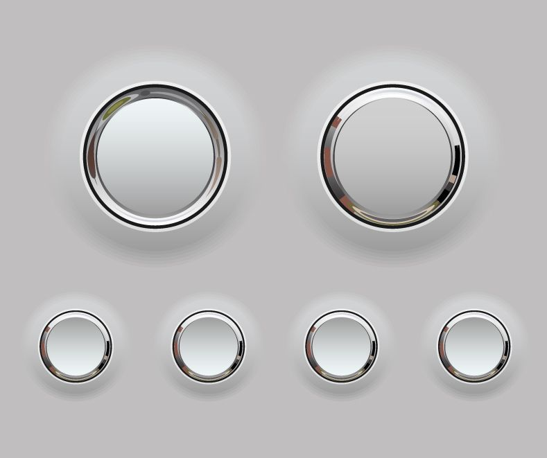
The physical characteristics of a push button can be described like this:
- They protrude from the surface.
- Some are concave or convex to communicate, all be it subtly, that your finger belongs there – that you are required to push.
Buttons were inherently physical objects. So, when digital interfaces came along, designers used the familiarity with real-world objects to teach people the function of these graphical elements. They started off looking a bit like this:
Then, over time, the “Medium” of digital evolved. Partly through fashion and a need to differentiate in the market, partly through a requirement to ship more quickly, skeuomorphism started to seem ‘dated’ and big companies like Apple and Google (the ones we rely on as proxy for ‘good, tested design’) decided that we would enter an era of an increasingly minimal aesthetic which ended up in flat design.
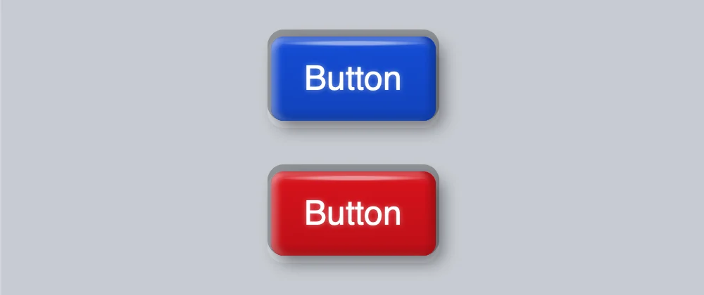
Soon enough, lead by the large companies, ‘buttons’ started to look like this:
And of course, our language didn’t change – we kept calling them ‘buttons’, but their physical characteristics – their affordances – slowly evolved. And, unless you evolved with them, these squircles and circles above don’t look anything like a ‘button’ anymore.
The problem is, we the designers are evolving with and making up our own affordances and forgetting that ‘regular’ people are not.
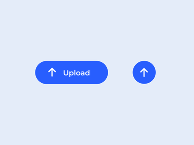
When I tell my dad to press ‘the upload button’, he doesn’t see it as a button. It’s just a blue shape with rounded edges or a blue circle with an up arrow in it. I can’t use the word ‘button’ when I’m coaching him over the phone through an interface he doesn’t understand because, well, these objects look nothing like actual buttons that still exist in the real world. And I haven’t even described the issue we’ve got with concepts like “Upload” and “The Cloud” here.
Our visual language has evolved, our language hasn’t
The evolution of the visual signals we’re using to denote functionality in the digital world isn’t just constrained to buttons. It’s happening everywhere.
Take ‘tabs’ for example – the ones we use in internet browsers. The word ‘tabs’ comes from the appropriation of the physical tabs we use to separate sections of a document, like this:
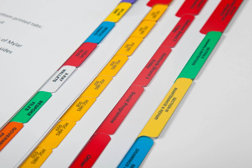
So, in the early days of UI design, designers quite rightly took that metaphor, guided by the affordances it gave us via their shape and made the early internet browser:
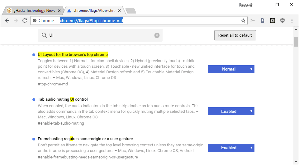
This metaphor has persisted surprisingly skeuomorphically over the years. In most desktop internet browsers, the use of tabs is still the ‘norm’, and we still say things like, “I have too many tabs open.”
What’s interesting though, is what we see on mobile. This screenshot is of the latest Chrome browser (yes, another Google product, the ones we rely on for direction).
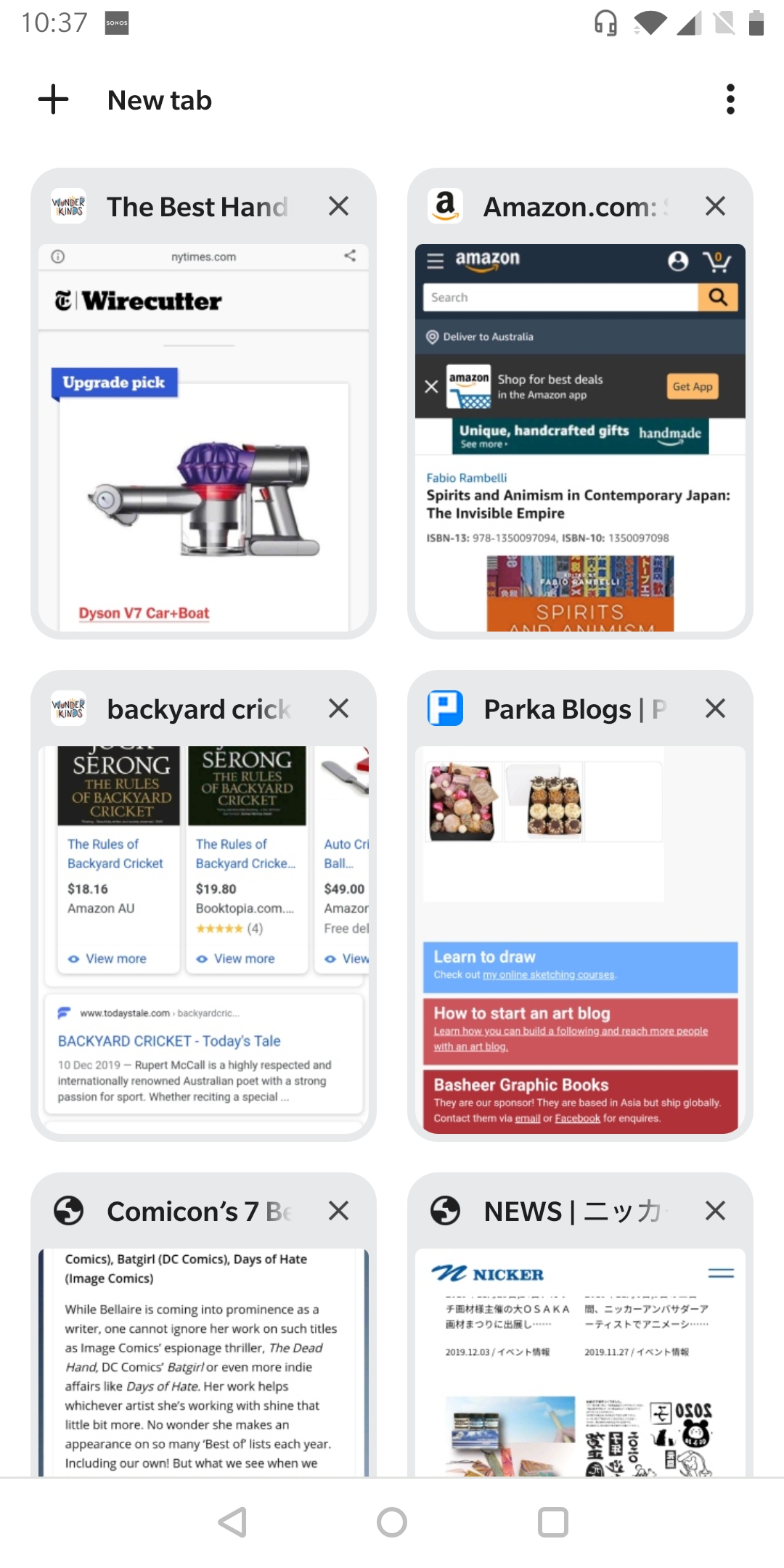
I can see the call-to-action (which also looks nothing like button), “New Tab”, in the top-left corner of the screen. But, I don’t see anything here that looks anything like a tab. Maybe they’re windows? Squares? Perhaps they’re buttons, now?
This would be fine if you’ve used a desktop internet browser before, but what if you haven’t? What if you’re in the increasing number of people on the planet who have only ever used a mobile device? What does “tab” mean to you now?
Once you start looking for it, it’s everywhere. And, you might think, “what’s the big deal? People will learn it once they use it and then they can evolve with it, just like the rest of us?” Well, to them I say this:
Imagine if you felt like a banana and you asked the grocer to give you one. Instead, they gave you an orange. And then you said, “that’s not a banana, I want a banana”. And then they gave you an apple, instead. In today’s world, we’d give the grocer a 1-star review and move on. Eventually, they’d go out of business and we’d say, “Well, that’s good, they didn’t know what they were talking about, anyway.”
This isn’t about anti-evolution, it’s about exclusion.
I’m not saying our craft shouldn’t evolve; that we should continue to replicate the physical world or that we should be limited by what physical manufacturing is capable of in any particular decade. But, what we’ve done, slowly and steadily, drip-by-drip, is made it very difficult for anyone who isn’t us to use and access services that are vital for their wellbeing and existence in society.
UI isn’t the only problem with software – it’s also how we make it and model it.
Here are just a few datapoints from Digital Inclusion Index Australia:
- 1.25 million Australian households without internet access at home in 2016-17 (14%)
- 79.1% of people educated to year 12 or below use the internet, compared with 96.7% of people with a tertiary qualification
- More than two thirds of people who are homeless had difficulty paying their mobile phone bill in the last 12 months
This means it’s about how perfomant we can make our services so that those with limited bandwidth have access. It goes beyond ‘AA accessibility’ tickboxing because not recognising a button as a button, or a tab as a tab isn’t in the WCAG guidelines – it’s about human-ness.
More than 1.3 million Australians with disability did not access the internet in the last 3 months. One quarter of these people report lack of confidence and knowledge as a reason for not accessing the internet.
It won’t happen to me
It’s easy to think that because we work in digital and we’re evolving with the patterns, we’ll be OK. That once we’re on the train, we’ll stay there. It’s our job, after all, to understand what’s emerging in the evolution of our visual language online – how we implicitly communicate form and function to our users as well as how things actually work. I’ve often remarked to people that working in software is my insurance policy against being excluded as I age. But, now at 37, I can already feel it happening.
It happens slowly, and that’s the problem – before you know it, you’re alone.
I have no idea what tools ‘the kids’ are using these days (Gen Z and younger). I mean, I know TikTok exists (our next big ‘global app that everyone uses’), but I don’t use it. But, because ‘everyone’ does, TikTok’s designers have incredible influence and power in establishing interaction design patterns that users will learn and future products will leverage as they evolve their own language. If I miss the TikTok train, how much further do I slip behind? As the saying goes, first we make the tools, then the tools make us.
It turns out that Gen Y and X are one of the first two generations in the history of humanity who are using decidedly different tools to that of the generations before. It used to be that our parents and grandparents taught us how to do important things in life, now it’s the reverse – we spend hours on the phone helping them link their COVID-19 Vaccination Certificate to their ServicesNSW App so they can access important services that are vital to their ongoing wellbeing and inclusion in the community.
We have to fix this before we get there
It’s easy to criticise, but maybe that’s what’s needed here. As a set of professionals who have immense power to shape the way humans and computers (and humans and humans) interact with one another, by all accounts, we’re doing a pretty shit job. Those tiny decisions we make every day have cumulative effects that are creating a more divided and unequal society by the day.
We could keep going this way. We could slowly but surely be the ones who, towards the end of their lives, can no longer access important services or interact with businesses like cafes, cinemas, and restaurants because we can’t figure out how to order food or movies anymore. Maybe we’re OK with that? But also, maybe we’re not.
What needs to change? It’s easy to be overwhelmed by everything. To think that one person can’t make the difference. But, if nothing different happens, then nothing will change so here’s a few simple suggestions that I’ve applied to my own life. I offer them to others:
Prioritise research and testing in our day-to-day work.
Maybe it’s not OK anymore to ship that small innocuous feature without doing a little bit of testing on it first. Maybe it’s no longer OK to rely on what Google, Netflix, Facebook, or TikTok are doing to achieve a similar function to the one you’re trying to design. It’s easier than ever to get access to millions of people, around the world, to confirm or confront your internal biases in the design solutions you put forward within your team.
Recognise that there is no ‘everyone’.
“Everyone” does not use Google. “Everyone” does not use TikTok. “Everyone” does not use Netflix. We can’t assume that just because Google design something a particular way we can lift it and the users we design for will automatically ‘get it’. I’m not saying that we can’t use familiarity at all, we should just make sure that it works for who we’re designing for in our day-to-day as well. Maybe your users don’t use Google, TikTok, or Netflix.
Callout who we’re excluding.
Because every business is different, every ‘market’ is different. It’s easy to say, “Our target market is 35-44-year-old women with children.” That gives focus to the team, sure. But also calling out who gets left out in this scenario at least surfaces who you’re leaving behind. Are we talking inner-city women with children who have access to good bandwidth and widespread mobile coverage? Yes? No? Being clear on the boundaries of who you’re designing for means you’ll have clear boundaries of who you’re excluding – then we can ask the next most important question, Is that OK? Who might we harm?
Don’t blame parents (grandparents or carers), blame designers.
Our parents and grandparents taught us how to interact with the world so, maybe now, it’s time for us to help them do the same until Design is fixed. Recognising that it’s not the older generations lack of ability or fault that ‘they don’t get technology’ is the first step. It’s not that at all, it’s just that for 2+ generations, we’ve left them out of the conversation about how they understand the world and how they want us to shape it for them. Maybe, it’s time we start listening. For their sake, and for ours because it won’t be long until we’re them and we’re calling our loved ones to ask how on Earth we can watch a movie we want to watch these days.
It’s not too late
I have faith that we can turn this around. The designers I know don’t intentionally set out to the do the wrong thing, but as E.F Schumacher states so profoundly in his 1973 book, “Small is beautiful: Economics as If People Mattered”:
Unintentional Neocolonialism results from the mere drift of things, supported by the best intentions.
And so, we have to stop this drift. This isn’t just about computers, the internet or even technology. It is about using technology as a channel to improve skills, to enhance quality of life, to drive education and to promote economic wellbeing across all elements of society. To be digitally inclusive is really about social inclusion. The opposite is true, too.